Apple Widget Concept, March 2023
A study in microsessions
Mobile microsessions (i.e., microusage) are mobile sessions shorter than 15 seconds. More than 40% of mobile usage is microusage.²
Problem
Over the last couple of years, I've grown to love widgets in iOS. That said, they're nothing new. Over the years, we've seen widgets for multiple platforms come in and out of fashion. Most people consider them a novelty—or even a nuisance—until they find one that works for them. So what separates the wheat from the chaff?
The best widgets create high-quality microsessions; in other words, they save time for the user by expediting a task they already complete regularly. By allowing users to quickly view key information, we can help them prioritize tasks or even avoid launching an app.
Well-designed widgets create great mobile experiences, increase productivity, and reduce screen time. So, what about the desktop experience? In MacOS, widgets are currently hidden in the Notification Center.
Solution
I saw an opportunity to improve the user experience by designing widgets that can be placed directly on the desktop. By allowing users to place widgets on their desktops where they could always be visible, we could streamline the process of accessing information and completing tasks. Before diving into the design phase, I sought existing research on widgets and gathered users' insights to better understand the problem and its potential solutions.
My Role
Developing a research plan, conducting primary and secondary research, designing the concept, and anticipating possible testing methods
The Team
I acted as solo researcher and designer with a little help from ChatGPT.
Tools Used
Figma, Adobe Suite, Principle, FigJam, Apple Notes, ChatGPT, Reddit
Research
Research
Since the impetus for this project was my desire to improve my own experience in MacOS, I knew it was necessary to seek user data to back up my assumptions. Therefore, I drafted a research plan including goals, assumptions, and methodologies.
Research Plan
Consumer Trends
In November 2020, after the launch of iOS 14, Sensor Tower data showed that homescreen widget apps were installed on 15% of iPhones.³ I couldn't find much data about current adoption or retention of widgets in iOS, but conversations online indicate users seem to like widgets, wish they had more⁴, and wish they could do more.
Competitive Analysis
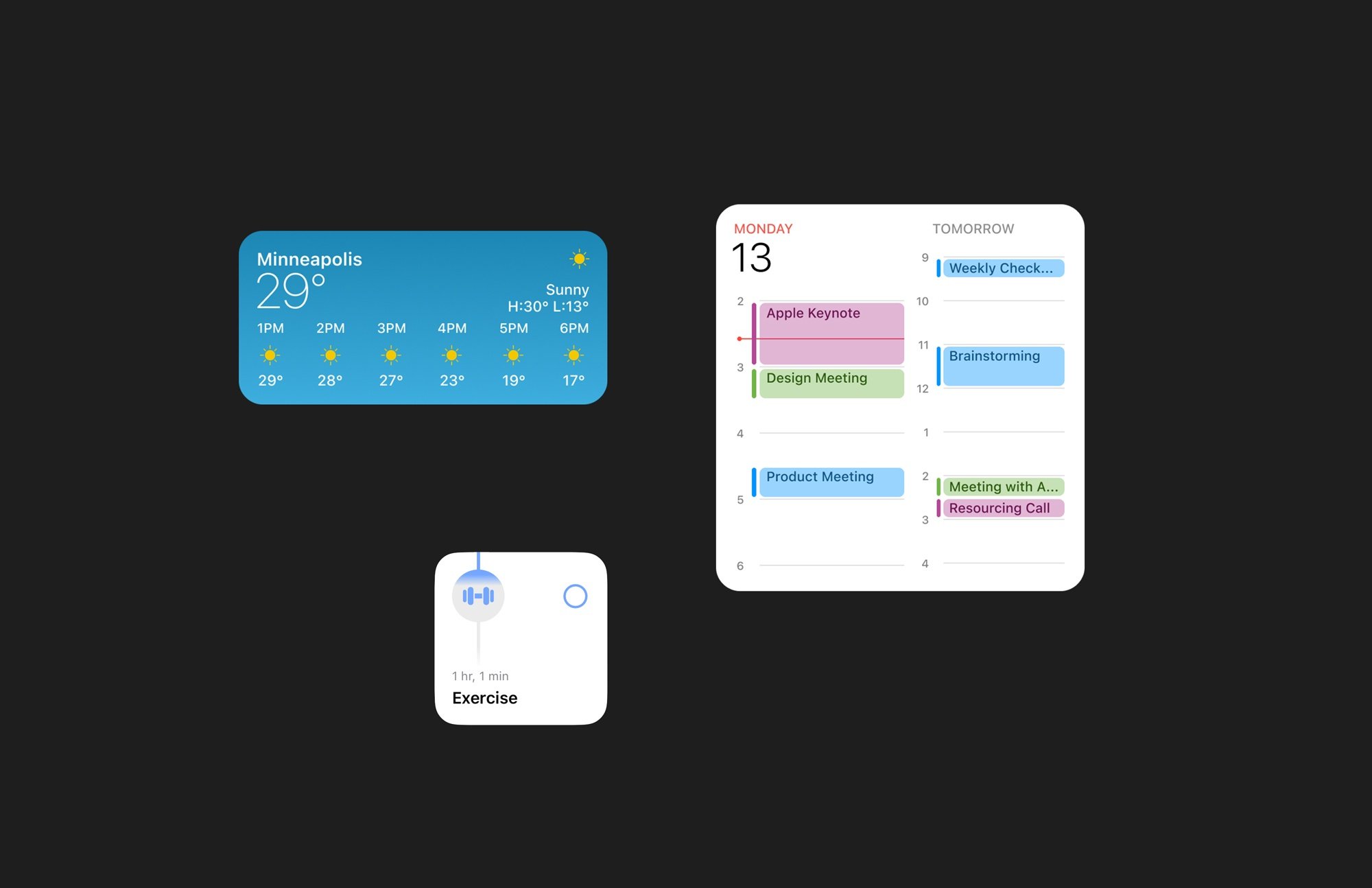
To ensure I wasn't solving a problem that didn't exist, I looked around for examples of existing widgets in iOS. According to Nielsen Norman Group, utilizing relevant content and interactivity creates the best user experience. Unfortunately, only some existing iOS widgets do so. Some best-in-class examples include Calendar, Weather, and Structured, which update several times a day to display frequently changing information.
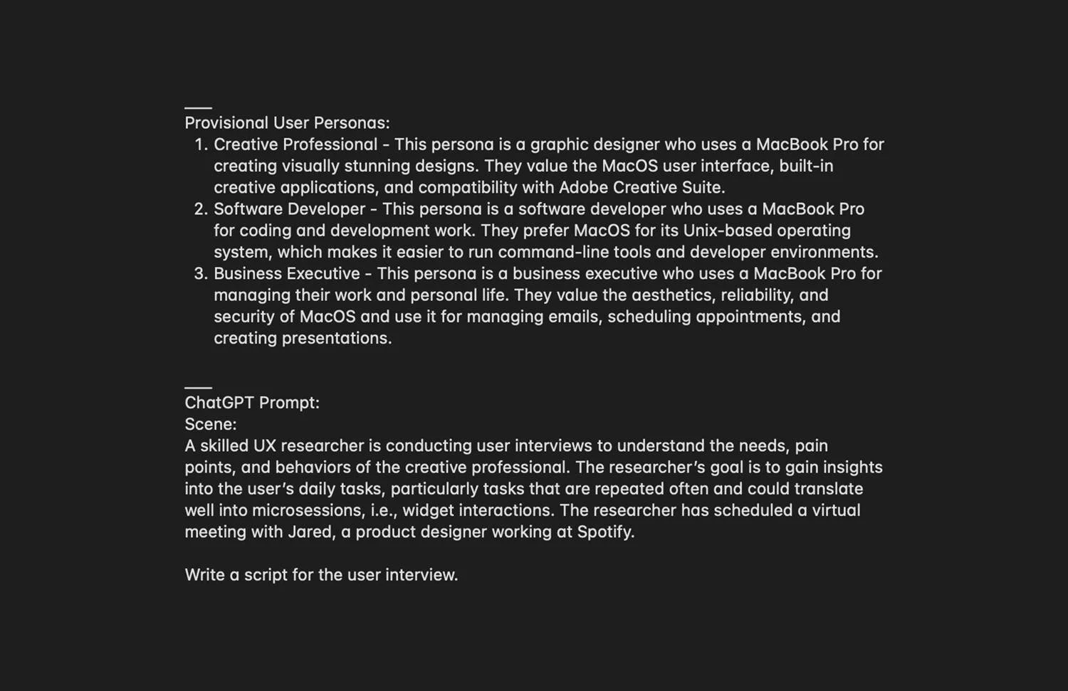
Since this project was exploratory/fictional, I decided to save time and money by generating research data through Chat GPT prompts and responding accordingly. As such, I wrote prompts for 3 provisional user personas, basing the profiles on consumer trends and research assumptions. Then, I used ChatGPT to generate interview scripts and empathy maps for each persona. Then, I evaluated the scripts to determine considerations and possible future widgets for each persona. View the full scripts and empathy maps.
"Interviews"
User Personas
By generating some qualitative data, I better understood my users' needs and pain points. For example, all three personas spent a lot of time navigating between apps to check for updates or comments from colleagues, which could be alleviated with well-designed and well-placed widgets. Based on the research, I determined which apps users check most frequently and formed a preliminary hypothesis as to which bits of information would be the most useful to display.
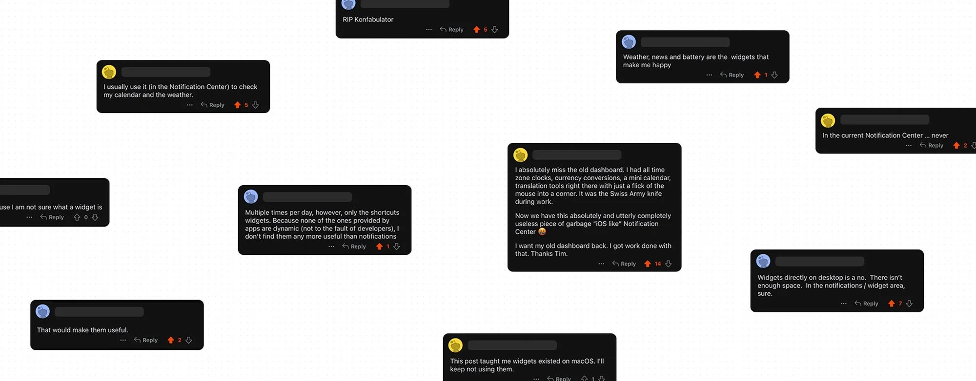
Before jumping to ideation, I gathered insights from users by posting polls to key communities on Reddit. Given the polarizing nature of widgets, I entered into this portion of the study assuming I'd get a fair amount of dissension. I asked users to rate their interest in placing widgets on the desktop in MacOS and how often they use widgets on various platforms.
Based on 2 surveys with ~250 participants, 35% of users use or view widgets on their iPhone or iPad multiple times a day, while only 9% have the same experience on their Mac or MacBook. In a separate survey with 508 participants, 35% of users were interested in placing widgets on their desktops.
Comparing previous adoption rates with the survey results, it's safe to assume interest in widgets is growing. Therefore, I charged ahead into ideation.
Gathering Insights
Ideation
Ideation
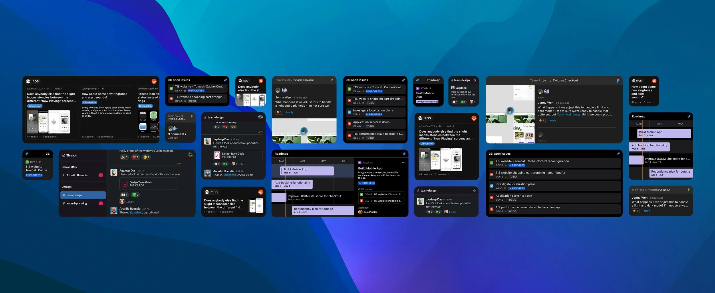
Since desktop tasks differ from mobile or tablet tasks, I decided to pay special attention to the applications used frequently on desktop by the three personas. The apps I selected were Slack, Jira, Figma, and Reddit. While Slack and Figma don't currently support widgets, Jira and Reddit have existing widgets that offer limited functionality. Considering possible use cases on all screen sizes, I narrowed down the best outcomes for each widget.
Sample Widgets
I started by selecting an application used regularly by all three personas, Slack. To identify pain points and areas of opportunity, I created a hypothesis-based user journey map looking at the current state for the user. Main takeaways: Desktop users waste time reading irrelevant messages whenever the Slack icon in the Dock shows a notification icon, which leads to a bad experience and decreased productivity. Users can make informed decisions about a message’s relevancy if they can see the latest messages from key sources at a glance.
User Journey Map
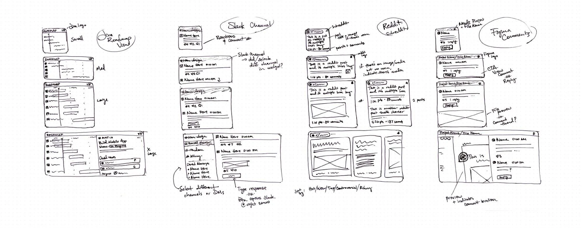
To avoid getting quagmired in the details, I started with pen-and-paper sketches which served as wireframes for the widget designs. I looked at each app's mobile and desktop versions to ensure I was utilizing existing components. Additionally, I considered possible customization options, e.g., tracking feedback in a Figma project, messages in a specific Slack channel, or progress in a Jira roadmap.
Sketches
Visual Design
Visual Design
When designing prototypes for the MacOS desktop widgets, I worked in Figma using my sketches and Apple Developer best practices as my guiding light. This included utilizing Apple system fonts, sizing, and spacing to decrease visual clutter and create a consistent experience. In addition, I mirrored the in-app experience whenever possible for consistency and quick scanning. To explore interactivity, I created prototypes that could display real-time information with minimal user input. Additionally, I created dark versions of the widgets to ensure consistency with MacOS's dark mode.
Prototypes
Self Sufficiency
The best microsessions are self-sufficient, i.e., they happen when users can interact with a fully-formed idea that does not require them to go elsewhere to understand it. If it's impossible to avoid truncating the text, giving users enough context to decide if they're interested is best.¹ As such, I designed widgets that show as much information as possible without cluttering the experience.
Interactivity
Although iOS and MacOS don't currently support a high level of interactivity within widgets, users are asking for this functionality, so I decided to explore it. Building interactivity into widgets can lower interaction cost, which leads to a good user experience. Since desktop screens can accommodate larger widgets, I designed versions allowing users to preview multiple channels before launching the application. That said, any interactivity should be kept minimal to avoid battery drain.
Dark Mode
To ensure an optimal experience for every user, every widget I designed includes a dark version.
Evaluation
Evaluation
Since this project was self-directed, hypothetical, and lasted only a few days, I didn't perform additional research. That said, here's where I'd start:
Future Plans
Assuming I had the resources to adequately research the topic of adding widgets to the desktop in MacOS, I would start by identifying the latest consumer trends regarding the use of widgets in iOS, iPad OS, and MacOS. I would also conduct higher-quality surveys among audiences matching target profiles to determine recurring tasks and pain points and gather insights on which additional widgets users want. Also, I would survey the level of interest in the widget prototypes, assuming that interest levels would increase when people can see what is being proposed and understand the value proposition. Finally, if the results indicated adequate interest, I would follow those surveys with user interviews and ethnographic field studies (i.e., observing user behavior in situ).
Additional Research

Testing Plan
After adjusting my approach according to the research data, I would test the widget designs on mobile, tablet, and desktop to further determine if they have the right functionalities and if they do a good job communicating data at a glance. In addition, I would allow early adopters to test the widgets directly on their desktops to assess overall functionality, usefulness, and pain points. Lastly, I'd use feedback to continuously iterate and improve upon the widget designs.
Sources
¹Nielsen, J. (2016). Mobile Micro-Moments: The New Battleground for Customers. Nielsen Norman Group. Retrieved from https://www.nngroup.com/articles/mobile-microsessions/
²D. Ferreira, J. Goncalves, V. Kostakos, L. Barkhuus, and A. K. Dey. 2014. Contextual experience sampling of mobile application micro-usage. MobileHCI '14. DOI: https://doi.org/10.1145/2628363.2628367
³Sensor Tower. (2021, November 10). The Top iPhone Widget Apps after Month Two: Downloads and Revenue for the Top Performers. Sensor Tower Blog. https://sensortower.com/blog/iphone-widget-apps-month-two
⁴As of March 15, 2023, searching “iOS widgets” on Reddit reveals numerous feature requests for iOS widgets over the last year and beyond.
More work:
Building a friendly intake flow for Options MD
Product & Identity Design, 2022
Streamlining discovery and booking at Wehmann
Website Design, 2018
Creating excitement for KNOCK, inc.
Website Design, 2018

